 scandi
01
the wordmark is our signature. lowercase, soft, with a stylized c
that doubles as a smile c:. give it room to breathe — clear space
equal to the height of the smile on every side.

02
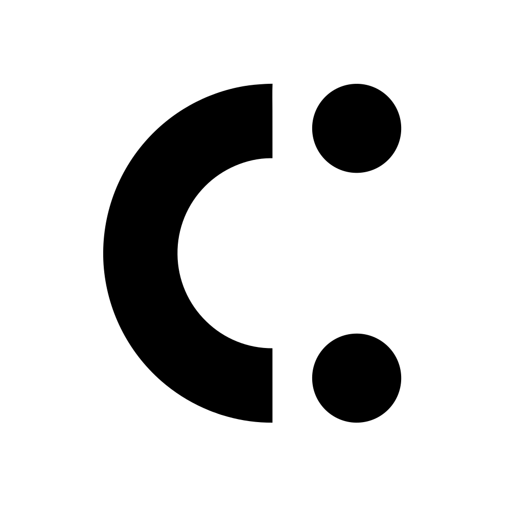
when there's no room for the full wordmark, the smile carries us. it's the rotated c: from the logo — friendly, calm, unmistakable. use it as a favicon, app icon, profile picture or end-frame stamp.

03
three colors, one gradient. the system is built on contrast — black and white for clarity, the blue gradient for energy. tap any swatch to copy.
our signature mood. 135° from #2BB7EE to #22D3EE. text and the wordmark always sit in white over it.
linear-gradient(135deg, #2BB7EE 0%, #22D3EE 100%);
04
we use aeonik pro across the whole system. modern, neutral, a touch geometric. three weights cover almost everything we ever need.
aeonik pro · bold
download .ttfsmiles, simplified.
Aa Bb Cc 0123456789 · the quick brown fox jumps over the lazy dog
aeonik pro · medium
download .ttfsoft tech, sharp craft.
Aa Bb Cc 0123456789 · the quick brown fox jumps over the lazy dog
aeonik pro · regular
download .ttfa friendly default.
Aa Bb Cc 0123456789 · the quick brown fox jumps over the lazy dog
@font-face {
  font-family: 'Aeonik Pro';
  src: url('assets/fonts/Aeonik Pro Regular.ttf') format('truetype');
  font-weight: 400;
}
@font-face {
  font-family: 'Aeonik Pro';
  src: url('assets/fonts/Aeonik Pro Medium.ttf') format('truetype');
  font-weight: 500;
}
@font-face {
  font-family: 'Aeonik Pro';
  src: url('assets/fonts/Aeonik Pro Bold.ttf') format('truetype');
  font-weight: 700;
}05
the scandi pattern — a frosty blue motif inspired by nordic textile. treat it as texture, never as the headliner. great for backgrounds, social tiles, packaging fills and divider strips.
1024 × 1024 png · tileable · use at low opacity over white, or full-bleed for editorial moments.
06
we sound like a friend who happens to be good at their job. simple words, warm tone, a little clever — never loud.
warm. confident. quietly playful. we don't shout, we smile.
lowercase by default for headlines and packaging — it feels softer and more human. uppercase only when emphasis really matters.
short sentences. plenty of air. if a word can leave, it leaves.
a stray c: at the end of a message is welcome. it's our smile.
07
everything in this brand book — logos, symbols, fonts, pattern — bundled in one zip.